


When it comes to business card printing, sticker printing, flyers printing, or any printing, Color means everything in the quality of the printing outcome. Despite in the latest software technologies, here are some aspects that you should be aware of while preparing an artwork for your prints.
1. Apply only CMYK while selecting the Color Mode for your artwork.
Table of Contents
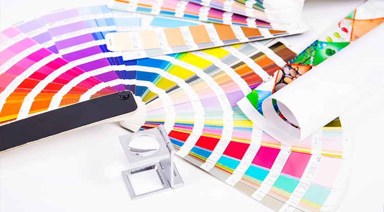
CMYK, known as Cyan (C), Magenta (M), Yellow (Y), and Black (K), is the most important colour element that has been widely used in the printing industry. Whether it is digital printing, offset printing, flexographic printing, rotogravure printing, silkscreen printing, CMYK serves as the basic color element in every single printing division. By combining these four elements in a different saturation, we can come out with a uncountable color combination into our prints! Therefore, all prepress technicians will run their color separation based on these four color elements. Any RGB or Pantone application might lead to color inaccuracy during the print output.
2. Avoid any application of Color Tone below 10%


There will always be a difference the visual effect of your artwork in your computer or laptop screen, comparing to the actual print. Light color shades that is below 10% will always be printed lighter than what is displayed in the screen. When there is any application of light shade printing, remember to darken it by a little more in your color setting.
3. Avoid a Total Ink Percentage of More than 240%
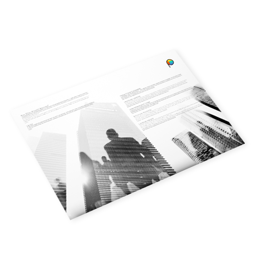
All printing is done in a way of overlapping Cyan, Magenta, Yellow, and Black in a different saturation percentage, in order to form an uncountable combination of colors. Hence, when too much ink is printed on each sheets, it may lead to issues such as drying difficulties, and further causes a certain sheets sticking on each other. Sticking sheets will later results in smeared printing, or damaged sheets. Do refer to the illustration below for a better understanding.


4. Apply At Least a Difference of 10% on the Color for any Toning Effect in your Artwork
When there is a similar color applied in your artwork, Printoka strongly suggest that there should be at least a 10% difference in the toning of each colour, in order to make a difference of the visual effect during printing. Try referring to the illustration below for a better understanding.


With all the methods above, we are very sure that your artwork will be at a standard that every printer hopes that they can receive, in order for them to make the most out of the printing technology for your print jobs.
If you find the article useful, feel free to sign up or subscribe to our website, so you are able to keep updated to all promotions and new products available in our website. Printoka Malaysia will always be glad to assist you in your printing needs. There is another article that we think its worth your reading if you wish to learn more about Fonts and Line Management in your Artwork. Find out more at Printoka.com


 Contact us