Printing is an industry of precision. Every small aspects will have an impact on the outcome. Thinking of the whole industry again, every fine resolutions being printed on sheets of papers and materials has been done using Mega Machines that can fill up a normal sized Terrace House. To keep things as precise as possible, here are some tips that we wish all graphic designers can know more in order to make printing at lower risk and higher quality.
Use a Minimal Font Size of 4 points or Larger in your Printing Artwork
When printing machines gets really huge, we usually requires some allowance for small room of misalignment during printing. Therefore, by using a “not so small” Font Size, it can largely prevent any blurry words, which is caused by tiny hair-sized misalignments when CMYK overlaps. The blurry words will reduce the readability standard as it may seem that each fonts or lines have shadows.
Create Outline for all Fonts before Converting Artwork into PDF
Designers are always creative in making unique and outstanding artworks. However, there might be some possibility that printers does not have the specific font in their designing software. It might lead to issues such as unreadable fonts, unaligned spacing as some arrangements might be adjusted automatically, or etc. To overcome this, there is one simple step that you can apply to help your printer in reducing the risk of any misalignments; which is Creating Outline. Doing so, you are able to change all the fonts into image, and the all designing software will identify your unique fonts as image.
In a situation that you really couldn’t avoid small texts, here are some tips for you:
1. Avoid using White colored texts with colored background
![]()
Illustration above shows a brief example on the effect of thin white text fonts being printed on a colored background.
2. Avoid Light Colored Texts with white background
![]()
Illustration above shows a brief example on the effect of thin text fonts being printed on white background. The readability can be improved by using a thicker or wider font type.
3. Avoid Thin-Lined Font Types
![]()
![]()
Very similar to the issue above, thin lined fonts are not suitable for prints. Hence, any thicker or wider fonts can solve the issue.
4. Apply only Black (K=100) for all text and lines

Setting all fonts and lines using Black only, will prevent shadow-like printing misalignment issue, which will further affect the readability level.
5. Avoid using any Line at the weight of 0.25 pts and below
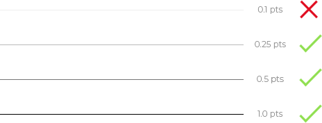
As per illustration above, any thin line below 0.25 pts might cause some issue in the readability. It is very suggested that you should use thicker lines for the best printing outcome.
If you find the article useful, feel free to sign up or subscribe to our website, so you are able to keep updated to all promotions and new products available in our website. Printoka Malaysia will always be glad to assist you in your printing needs. There is another article that we think its worth your reading if you wish to learn more about Color Management, and Image Resolution. Find out more at Printoka.com